Data communication
"Big Data" is....
- multidimensional
- continuous & discrete
- nonlinear
- noisy
...complicated.
Wise words
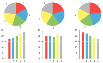
"Graphical excellence is that which gives to the viewer the greatest number of ideas in the shortest time with the least ink in the smallest space."
Visual Display of Quantitative Information, by Edward Tufte
Processing visual information

- quantities
- length
- area
- scale
- relationships
- proximity
- similarity
- connection or boundary
- attention
- narrative
A grammar of graphics?
- aesthetics
- geometric objects
- scales
- coordinates
- statistics
- facets
- annotations
Grammar of Graphics, by Leland Wilkinson
ggplot2
- Clear, consistent syntax based on "grammar of graphics"
- Layer system for adding new elements to a plot
- Facet system for subsetting data into series of related plots
In [6]:
%%R -w 10 -h 6 -u in
mpg_plt <- ggplot(data = vehicles_mpg, aes(y = mpg, x = year, color = mpgtype)) +
           geom_jitter(alpha=0.5, width=1) +
           xlab("Year") + ylab("Miles per gallon (mpg)") +
           scale_fill_discrete(labels = c("city", "highway"),
                               name = "Mileage type") +
           ggtitle("Gas mileage of car models over time")
mpg_plt
In [7]:
%%R -w 10 -h 6 -u in
mpg_plt <- ggplot(data = vehicles_mpg, aes(y = mpg, x = year, color = mpgtype)) +
           geom_point(stat = "summary", fun.y = "mean") +
           stat_summary(fun.data = "mean_se", geom = "errorbar") +
           xlab("Year") + ylab("Mean miles per gallon (mpg)") +
           scale_color_discrete(labels = c("city", "highway"),
                                name = "Mileage type") +
           ggtitle("Gas mileage of car models over time")
mpg_plt
In [8]:
%%R -w 10 -h 6 -u in
mpg_plt <- ggplot(data = vehicles_mpg, aes(y = mpg, x = year, color = mpgtype)) +
           geom_smooth() + xlab("Year") + ylab("Mean miles per gallon (mpg)") +
           scale_color_discrete(labels = c("city", "highway"),
                                name = "Mileage type") +
           ggtitle("Gas mileage of car models over time")
mpg_plt
In [23]:
%%R -w 10 -h 6 -u in
displ_plt <- ggplot(aes(y = mpg, x = year, color = mpgtype),
                    data = vehicles_displ) + geom_smooth() +
                    facet_wrap(~ displ_bin, nrow = 2,
                               labeller = label_bquote("Displacement"
                                                       >= .(displ_bin))) +
                    xlab("Year") + ylab("Mean miles per gallon (mpg)") +
                    scale_color_discrete(labels = c("city", "highway"),
                                         name = "Mileage type") +
                    ggtitle("Gas mileage of car models by engine displacement")
displ_plt
Switching to Python
- Readable code
- Faster and more powerful
- General-purpose language
- More widely used in industry
- Testing framework
- Easier to deploy and release
Data visualization packages in Python
matplotlibseabornggplot
matplotlib
Python port of Matlab plotting library
| Pros | Cons |
|---|---|
| Based on widely used Matlab library | Hard-to-parse syntax |
| Functionality for interactive plots | Ugly default style |
| Specialized plot types, including 3D | Difficult to customize style |
| Manual subsetting of data for plotting |
In [12]:
fig, mpg_plt = plt.subplots()
colors = {"hwy": "blue", "cty": "red"}
for mpgtype, color in colors.items():
    type_filter = vehicles_mpg["mpgtype"] == mpgtype
    mpg_plt.scatter(x = vehicles_mpg[type_filter]["year"],
                    y = vehicles_mpg[type_filter]["mpg"],
                    c = color, alpha = 0.5, edgecolor = "none")
mpg_plt.legend(["highway", "city"], title = "Mileage type",
               loc = 2, frameon = True)
mpg_plt.set_title("Gas mileage of car models over time")
mpg_plt.set_xlabel("Year")
mpg_plt.set_ylabel("Miles per gallon (mpg)")
Out[12]:
<matplotlib.text.Text at 0x119d27080>
In [13]:
fig, mpg_plt = plt.subplots()
for mpgtype, color in colors.items():
    type_filter = vehicles_mpg["mpgtype"] == mpgtype
    mpg_means = vehicles_mpg[type_filter].groupby(["year"])["mpg"].mean()
    mpg_sem = vehicles_mpg[type_filter].groupby(["year"])["mpg"].sem()
    mpg_plt.errorbar(x = mpg_means.index, y = mpg_means.values,
                     yerr = mpg_sem.values, c = color)
mpg_plt.legend(["highway", "city"], title = "Mileage type",
            scatterpoints = 1, loc = 2, frameon = True)
mpg_plt.set_title("Gas mileage of car models over time")
mpg_plt.set_xlabel("Year")
mpg_plt.set_ylabel("Mean miles per gallon (mpg)")
Out[13]:
<matplotlib.text.Text at 0x119f89c18>
In [15]:
fig, mpg_displ = plt.subplots(4, 2, sharex='col', sharey='row')
for n in range(8):
    plt.subplot(2, 4, n + 1)
    for mpgtype, color in colors.items():
        vehicles_filter = vehicles_displ.query("displ_bin == %i & mpgtype == '%s'"
                                               % (n + 1, mpgtype))
        mpg_means = vehicles_filter.groupby(["year"])["mpg"].mean()
        mpg_sem = vehicles_filter.groupby(["year"])["mpg"].sem()
        plt.errorbar(x = mpg_means.index, y = mpg_means.values,
                     yerr = mpg_sem.values, c = color)
seaborn
Wrapper for matplotlib
| Pros | Cons |
|---|---|
| Attractive default style | Difficult to customize and label |
| Simplified syntax | Limited range of plot types |
| Easy subsetting of data | Incomplete documentation |
In [16]:
mpg_plt = sns.stripplot(x = "year", y = "mpg", hue="mpgtype", data=vehicles_mpg,
                        jitter = 1.0, alpha = 0.5, split = True)
In [17]:
mpg_plt = sns.factorplot(x = "year", y = "mpg", hue="mpgtype", data=vehicles_mpg,
                         join = False, aspect = 1.5, size = 6)
mpg_plt.set_axis_labels("Year", "Mean miles per gallon (mpg)")
mpg_plt.set_xticklabels(map(lambda x: str(x) if x % 5 == 0 else "",
                            sorted(vehicles_mpg["year"].unique())))
Out[17]:
<seaborn.axisgrid.FacetGrid at 0x118c3edd8>
In [18]:
mpg_plt = sns.factorplot(x = "year", y = "mpg", hue = "mpgtype",
                         data=vehicles_displ, markers = [None, None],
                         col = "displ_bin", col_wrap = 4)
mpg_plt.set_axis_labels("Year", "Mean miles per gallon (mpg)")
mpg_plt.set_xticklabels(map(lambda x: str(x) if x % 5 == 0 else "",
                            sorted(vehicles_displ["year"].unique())))
mpg_plt.set_titles("Displacement >= {col_name}")
Out[18]:
<seaborn.axisgrid.FacetGrid at 0x1115ef160>
In [25]:
mpg_plt = ggplot(aes(y = "mpg", x = "year", color = "mpgtype"),
                 data = vehicles_mpg) + geom_jitter(alpha = 0.5) + \
          xlab("Year") + ylab("Miles per gallon (mpg)") + \
          ggtitle("Gas mileage of car models over time")
mpg_plt
Out[25]:
<ggplot: (306494570)>
In [20]:
mpg_plt = ggplot(aes(y = "mpg", x = "year", color = "mpgtype"),
                 data = vehicles_mpg) + stat_smooth(method = "loess") + \
          xlab("Year") + ylab("Miles per gallon (mpg)") + \
          ggtitle("Gas mileage of car models over time")
mpg_plt
Out[20]:
<ggplot: (289478576)>
In [26]:
displ_plt = ggplot(aes(y = "mpg", x = "year", color = "mpgtype"),
                       data = vehicles_displ) + stat_smooth(method = "loess") + \
            facet_wrap("displ_bin", nrow = 2) + \
            xlab("Year") + ylab("Miles per gallon (mpg)") + \
            ggtitle("Gas mileage of car models by engine displacement")
displ_plt
Out[26]:
<ggplot: (300849405)>
...vs ggplot2 in R
In [22]:
%%R -w 10 -h 6 -u in
displ_plt
Next steps?
- Contribute:
matplotlib: https://github.com/matplotlib/matplotlibseaborn: https://github.com/mwaskom/seabornggplot: https://github.com/yhat/ggplot
- Use R and Python together in Jupyter notebooks
- For interactive visualizations, see
ggvis(R) andbokeh(Python)
Endnotes
Notebook: https://github.com/hnlee/talks/blob/master/pyviz/pyviz.ipynb